I. Introduction
Lights, camera, action! Your script is ready, the actors are primed, and the director calls, “Cut! That’s a wrap!” But hold on—before you let your film hit the world, there’s one last, magical step that can elevate your footage from just okay to absolutely stunning: colour grading.
Colour grading isn’t just about making your video look visually appealing. It’s about setting the mood, enriching the narrative, and guiding your audience through an emotional journey. Whether you’re crafting a nail-biting thriller or a heartwarming love story, the right colour palette can make all the difference. Ready to jump into the colourful world of hues, tones, and saturation? Let’s dive in!

II. What is Colour Grading?
Alright, let’s break it down. Colour grading is like the final brushstroke on your video’s canvas. While colour correction ensures everything looks natural and consistent, colour grading adds that extra flair. It’s where you decide if your thriller will have a chilling blue tint or if your flashback scene should bathe in warm, nostalgic light.
Gone are the days of old-school Technicolor with physical filters and chemical magic. Today, digital tools let you transform a sunny day into a dramatic storm or turn a lush green forest into a fantastical realm—all with a few clicks.
Discover more about the history of colour grading here.
III. The Impact of Colour Grading on Visual Storytelling
Why bother with colour grading? Because it’s one of your filmmaking superpowers! Here’s how it can make your video truly shine:
Mood and Atmosphere
Want to amp up the suspense in a scene? Go for cool, desaturated tones. Need to convey warmth and coziness in a family drama? Warm, earthy colours are your best pals.
Character Development
Ever noticed how a character’s journey often mirrors the colour palette of the film? As they evolve, so do the colours around them. It’s like a visual mood ring, revealing their inner world.
Narrative Coherence
Keep things consistent. Using a cohesive colour palette ties your video together, making the story flow smoothly and keeping your audience engaged.
IV. Techniques and Tools for Colour Grading
Excited to get your hands on colour grading? Here’s a guide to help you get started:
Common Techniques
One popular trick is using LUTs (Look-Up Tables), which are like filters for your video. They give you a jumping-off point, but the real fun starts when you tweak them. Another nifty tool is curves adjustment, letting you play with brightness, contrast, and colour intensity.
For a deeper dive into advanced techniques, don’t miss our guide on Mastering the Art of Colour Grading: Transform Your Videos with These Powerful Techniques.
Software Options
When it comes to software, you’ve got options. DaVinci Resolve is a go-to for many pros, offering a comprehensive set of tools. But if you’re using Adobe Premiere Pro or Final Cut Pro, don’t worry—both have powerful grading capabilities.
Case Studies
Need some inspiration? Check out Mad Max: Fury Road, for bold, high-contrast colours that ramp up the intensity, or The Grand Budapest Hotel for pastel hues that create a whimsical, storybook feel. These films are prime examples of how colour can drive your narratuive.
V. How to Approach Colour Grading in Your Projects
Feeling inspired to start colour grading? Here’s how to dive in:
Planning Ahead
Think about colour from the start. What mood do you want to set? How should colours shift as your story progresses? Planning ahead will make your grading process smoother.
Collaborating with a Colourist
If you can, team up with a professional colourist. They bring technical know-how and a fresh perspective that can elevate your project to new heights.
Experimentation and Creativity
Don’t be afraid to play around! Try different colour schemes, adjust saturation, and see what works. The beauty of digital grading is that you can always undo and try again.
VI. Common Mistakes to Avoid
Even seasoned filmmakers can slip up. Here are some common missteps to avoid:
Overuse of Effects
It’s tempting to pile on effects and filters, but less is often more. Keep it subtle and let the story shine.
Ignoring the Story
Colour grading should enhance your narrative, not overshadow it. If your choices don’t add to the story, it’s time for a rethink.
Technical Pitfalls
Monitor Calibration
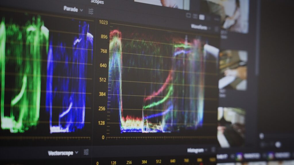
A key but often overlooked aspect of colour grading is monitor calibration. If your monitor isn’t calibrated, the colours you see may not match the final output, leading to inconsistencies.
Why Calibration Matters:
- Consistency: Ensures your colours look the same across all screens.
- Accuracy: Helps you make precise adjustments, so the final product matches your vision.
How to Calibrate Your Monitor:
- Use a Calibration Tool: Invest in a colourimeter or spectrophotometer.
- Follow Guidelines: Use the tool’s software to adjust settings like brightness and colour temperature.
- Regular Calibration: Recalibrate regularly to keep things accurate.
And there you have it—the lowdown on the art of colour grading in video production. Whether you’re just starting or looking to refine your skills, mastering colour grading can transform your storytelling. So grab your editing software, play with those colours, and see your videos come to life!
Ready to take your project to the next level but need a hand? Lumira Studio is here to turn your vision into reality. We’re passionate about every filmmaking step, from pre-production to post-production, and would love to work with you.


